It’s great developing your own content and getting your brand out there. However, if you’re not measuring the success of your marketing campaigns you'll struggle to keep track of the impact, both positive and negative. It’s crucial to get this right as it can feed into future plans, doing more of the what works rather than the white noise.
The biggest moans and groans we hear around reporting is the time allocated to it. You’ve got better things to be doing than spending hours on end looking through large sheets of numbers to decide if a project from six months ago worked or not.
You also struggle around what numbers are useful and what numbers are just making it look more complicated than it is. Maybe you can’t understand why each month isn’t going positively? Or maybe you simply don't know where to start - that’s fine, we hear you! And that’s why this post will run you through what you need, where you get it from and how to present it without it leaving you time poor.
We have a free measurement template for you to use, if you want to dive straight into your data!

There’s a lot of numbers out there
You need to get to the heart of what you’re looking to report on - the best way to do this is by thinking about who you’re reporting to, or for. What really makes them tick? Are they a numbers person? Or do they need an easily legible report? You also need to ask what kind of KPIs are in place, and are they focused on organic traffic, conversion, ROI, or all the above? When you answer these questions, you’ll have a good idea of what you need to report on and how the report needs to be delivered.
Locating the source
Any business in 2018 with a website should really have Google Analytics (GA) set up and working effectively - it’s digital marketing 101. To really get GA working for you, you should have all goals set up, including revenue and ecommerce data. One of the gems of GA is setting up your own customer segments – you can really specify what data you want to be looking at.
Segments work really well in terms of efficiency as they work the same way as setting a ton of filters but this way you only have to set the filters up once and you can have a custom segment going forward. So, from GA you can find a mountain of information, traffic figures broken down by channel, revenue data, or engagement data audience data (to name a few), but there’s also a wealth of third party tools out there to tell you how well (or not) you’re doing.
If keywords and visibility is more your thing then tools such as SEMrush, ahrefs and Search Metrics may be more appropriate - ahrefs boasts the biggest and most regularly updated keywords database which makes it a great tool for finding those golden nuggets which are really driving traffic. Of course using third party tools gives you a better understanding of where you are in the market and a very tangible unbiased view but it does take time to really make the data work for you - here at Zazzle Media we do it on a daily basis and you can try it too using our handy competitor research tool.
Decipher the data
Transforming all these numbers into something legible and tangible is the most important part – it’s the analysis that really brings data to life.
The most important part of data analysis is preparation and organisation. You’re going to find it very hard to read into ten spreadsheets of pure numbers so set up is crucial, as is compiling your data into a single sheet. For example, let’s say we’ve gathered 12 months’ worth of organic traffic data broken up into weeks. That’s 52 parts of data which is incredibly useful, but we need to read the story it’s telling. We need to ask ourselves one main question when looking at this data: ‘Is this what I’m expecting to see?’ If the answer is no, then why?
Reports are a great tool for measuring marketing activity as numbers don't lie. You may feel like everything is going well and your year has really taken off but if that feeling doesn’t translate into cold hard improvements in data then there’s a problem that needs to be tackled.
Excel has a great number of tools built in to make data analysis as easy as possible. Pivot tables can be used on all complete data sets to organise data into a legible table without all the time-consuming task of manually sifting through rows of information. Pivot tables effectively automate a whole load of ‘=SUMIF(‘ formulas and then aggregating the data into categories, see example below:
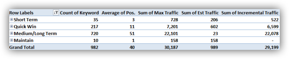
In this example, the Pivot table has aggregated all our data into four categories on the left-hand side and then summed together all the relevant information in the other five columns. For example, we can quickly extrapolate that the biggest opportunity is in the ‘medium/long term’ category as there’s 22,078 incremental clicks there due to the client ranking on average P51 only capturing 23 clicks a month and there’s also 720 keywords to target.
Excel is an incredibly powerful tool when analysing data, especially big data. It’s a scary world in Excel and Gsheets, full of formulas, arrays and queries but don’t worry if you’re not the biggest Excel wiz, because we have an array of handy tips for productivity!
The importance of BIG data
Big data is really undervalued concept - it's defined as ‘extremely large data sets that may be analysed computationally to reveal patterns, trends, and associations, especially relating to human behaviour and interactions.’ People are generally intimidated by big data as on the surface it’s a huge amount of information that does need some work to be able to decipher - but with the tools and methods I’ve mentioned that Excel has built in, it can give you very valuable insight.
Having a years’ worth of data is great. You can see and map trends and hopefully be able to associate certain peaks and troughs with any issues or marketing activity, giving you a great understanding of how the past 12 months have gone, but what every business is striving for is progress and growth.
Your 12 months of data may be telling a great story of constant growth throughout the year but if that growth is lower than the previous 12 months then it’s suddenly telling a very different story. Get the previous 12 months, 24, 48 - as far back as you can go, gather as many years’ worth of data as possible. This is how you’ll be able to see if you’re going forward, backwards or just stagnated.
In an ideal world, you want to be up YoY, constantly growing within your sector, but it’s wholly unrealistic to expect to always be up MoM, that’s just not how seasonality works. It’s important you have a firm grasp of your sector's seasonality trends. Without it you really cannot comprehend what growth (if any) you’re making. Even the biggest of sectors show massive seasonality rollercoasters throughout the year, as shown below:
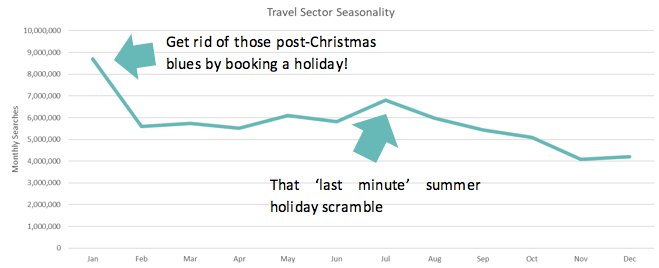
The main benefit of having a clear understanding of your sector's seasonality isn’t only so you can see and predict traffic figures fluctuations, but it can give your marketing plans real structure and the best opportunity to soar throughout the year. At Zazzle Media, we run seasonality across our keyword sets, meaning we have the best possible opportunity to create content and get it delivered at a time of year when people are really searching for it.
Make those numbers pop!
You want to be reporting and keeping records at least monthly, but ideally you should be reporting on a weekly basis. You'll want to refer to these reports on a regular basis so making it easy and legible is important too.
Everyone is incredibly busy so not everyone has time to look at a lot of numbers and decipher their own message from it. Graphs and charts are the easiest way to get your message across. Some clients might really get a kick out of getting lost in a hatful of data and some clients would rather see lots of positive, warm colours and their line on an upwards trend.
Having a personal relationship with our clients is something we pride ourselves on. Specifically, our client services team are brilliant at knowing what makes them tick and what they want to see in the reports, so we can create bespoke, personalised reports.
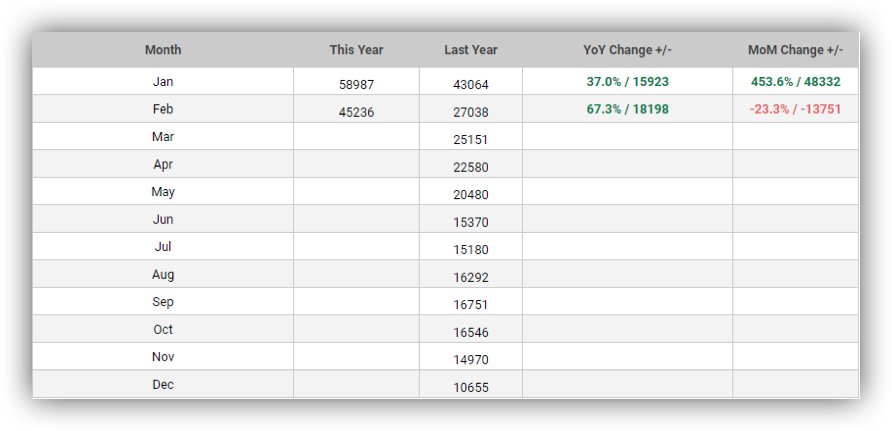
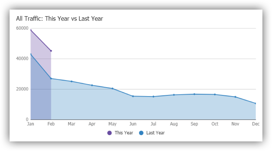
Below are examples of where we’ve provided data and graphs. We’ve provided this year’s organic traffic figures, last year's a MoM and YoY comparison which is conditionally formatted for ease, green being uplift and red being negative movement. Next to this, there’s also a stacked line chart to visually represent the year's figures.
Tying it all together
So, there we have it - we’ve covered the most efficient and effective ways to report on marketing activity with a search focus in mind. We’ve covered what metrics you can report on, making the most of the tools at your disposal, the importance of big data and about making it pretty and legible.
When reporting, it all comes down to making sure you know who you’re reporting for and what makes them tick. The rest you can execute from there. It can be a big confusing world out there when it comes to mountains of data but remember - it’s the analysis that brings data to life!
Don't forget to download our free SEO reporting template, to make your results tell a story!
Stay in touch with the Zazzle Media family
Sign up for our monthly newsletter and follow us on social media for the latest news.