Gone are the days where your homepage is the most important page on your website. Landing pages have taken that mantle by becoming an increasingly important weapon in your marketing arsenal, 48% of marketers have already adopted landing pages for their campaigns. Your homepage is a generalised page that pushes the brand message rather than actually driving conversion – it serves the purpose of navigating you around the site, not driving you to a singular destination. Using conversion centred design will ensure your pages are optimised to achieve goals.
What you will learn in this post:
- What are landing pages?
- How do you use research to aid the design?
- Tips for designing your landing page.
- How to do you go about testing?
You can also find two great example wireframes for you to see how your landing page might be structured to be as optimised as possible:
Landing Pages
A landing page is a targeted page that sits on your website with a strong sense of purpose.
That purpose is two-fold. Firstly, these pages drive a sale or service on your site. If you are driving traffic to this page through an ad, you are using this page to give the consumer further details about a product/service, telling them what they need to know to ‘seal the deal’. The second potential goal of a landing page is for lead-generation and gathering data on a prospective customer. Building a database of users will increase your potential reach and allow you to continue to market to the right people, effectively aiding an improvement in conversion further down the chain.
Landing pages are campaign driven and serve as the ‘arrival lounge’ for your ads. You need to consider what your conversion goal is going to be - sales, leads, data capture or sign-ups?
Let’s take driving sales for example. If you are selling a product and place an advert in a magazine/online to drive traffic straight to a ‘buy now’ page this can seem like a very cold way of communicating. It’s like your only purpose is to take someone’s money and that isn’t always a great look. For low value sales this might be perfect but, when you are asking for some investment from the customer, you should really try to win them over a little more. A landing page does just that and more. It gives customers an undistracted source of information and has a specific goal – to convert.
Landing pages also often don’t not fall under the same conventions as the rest of a site, giving you the option to be a bit more experimental with the design. This allows you to be more campaign-specific and make your marketing targeted to a certain audience. Your brand might have a much wider target audience than that of the campaign and the flexibility of landing pages allows you to reflect this.
Do Your Research
Now we’ve established how important landing pages are for your business, it is time to ensure you can make the most out of these pages. It is important that you do your research and there are a number of questions that you will need to answer in order to guarantee success:
What is your target audience?
You need to understand who you are targeting to ensure that your marketing carries the right message. Advertising to the wrong people will diminish the chance of getting the highest possible rate of conversion. You need to engage with people who already have an interest in what you have to offer.
Consider creating personas for your audience. This way you are able to recognise and visualise their likes and dislikes – answering questions about who they are, where they work and how they interact with you and your market.
What is the user journey like?
You also need to be able to understand the user journey in its entirety. How do customers reach your page? Will it be from online advertising, social media, video, Google? What does your campaign look like and where does the landing page fit it – is is the missing piece of the puzzle or does it need to show the entire picture? Say, for instance, the landing page continues to tell a story that started in an ad. If someone lands on the page from Google they will only see part of the picture, harming your conversion rate.
No journey is ever the same, so it is best to guarantee all bases are covered. Ask yourself: What do you want your customer to get from your landing page? Does it match what you are offering?
You should also break down the benefits of your product or service into bite-size chunks that are easily digestible for the customer.
Who are your competitors?
When you are doing your research, it is important to check in on your competition. Get an understanding of what your rivals are trying to achieve and whether it is different from your aims. Put yourself in the position of the consumer and see what they offer on their web pages. You can get a lot– good and bad – from this experience. It’s about learning lessons and spotting opportunities for things you can do better.
What is your tone of voice?
You need decide on the tone of voice that is going to appeal to your target audience. You want to establish a clear message and deliver it in a way that will be effective. Carefully consider which approach is best suited to achieving your end goal. Should your message be clinical and use short snappy facts to get straight to the point? Or, are you going to be more emotional in your messaging, using language to evoke feeling beyond cold hard facts?
When we talk of tone of voice, we don’t just mean the words either. In our Blogging for Your Brand series we covered how your imagery and photographic style can also adhere to these same principles. Again, you could be clinical and show off product features or you can be more evocative and creative with your photography.
Consider your content length too. It’s sometimes said that the greater the risk the customer has, the longer your content should be. This can be equally true for products and services which are expensive. The more a user has to invest, the more time they will invest to make sure they are doing the right thing.
What is your key call to action?
We established earlier that there are two types of landing page – click-through pages and lead-generation pages. Here is where they really differentiate. Each will need to have its own type of call to action (CTA). For click-through pages your CTA is going to be a button. The main aim of the page is to get the user from the landing page to a buying page. Alternatively, for lead-generation pages your CTA might be a form to sign-up up to a newsletter.
It needs to be obvious that this is the journey you want the user to take. Save on distractions and don’t send the user to other parts of the site. You should remove any links that don’t help to achieve the desired outcome and be aware of the attention ratio – any on-page links should be conversion-centric at a ratio of 1:1.
You can also have other buttons throughout the page - and this would actually help if you have a lot of detail to get through and the page is getting deep – and you don’t want to just have the CTA at the bottom of the page either as it might get missed. This is particularly important if you have a form on the page for lead-gen. You could include anchor links that will take you to the form for the user to fill. Maintain that 1:1 ratio.
Who else can you learn from?
It is good practice to look around the web for the best landing page examples. Have a look at what the big boys (Amazon, Apple, Google etc) are doing. Take note of the design considerations that they deploy and see how you could apply them to your landing page. Remember, they have huge marketing budgets and will have gone through a thorough testing process to get a page to a point where you are seeing it. This is a great way to fast-track your own knowledge base and use the tricks they have adopted to make your landing page a success.
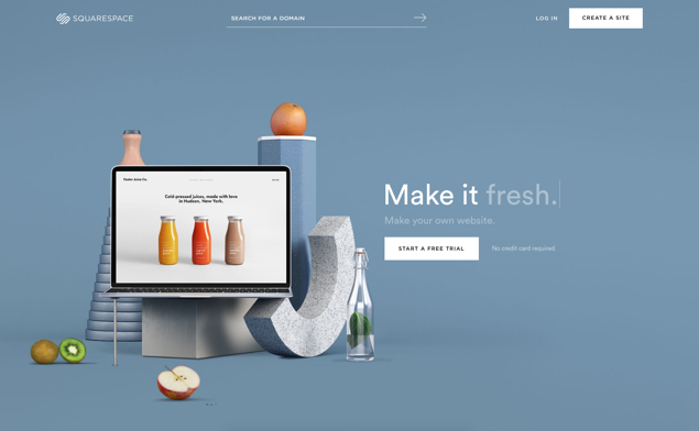
Designing Your Landing Page
Headlines, imagery and use of video
It’s important to nail down your visual style. Are there brand guidelines to consider? Again, refer back to your goal/message/target audience and ask if it fits. Consider the imagery/visuals you use. Are they on brand? As the age old saying goes, a picture tells a thousand words. This is particularly important for click-through landing pages and considering how to best represent the product you are selling. Aspiration is a big factor when it comes to how an audience sees your product, so don’t be lazy when it comes to imagery. Use pictures that tell a strong story.
Don’t forget typography choices too – legibility is vital for conversion. Also, is there a way to include video as a way to further captivate the viewer? Video is a great tool for increasing conversion – a study by EyeView digital proved that using video on landing pages increases conversion by 86%.
What is conversion centred design?
Having defined your visual style, tone of voice and general approach off the back of your market research, it’s time to learn how you can put this all to work with CCD (conversion centred design). You should consider the following principles to make the landing page work to the best:
1. Encapsulation
What is the most important part of the page? You need to consider your aim for the page and immerse the user into it. You want the messaging to be correct so they engage with that point straight away. It’s no good wasting time, you need to get on and reel off all the important features of your product.First impressions are vital. Are you going straight in with that hard hitting tag-line to get those conversions? You could go right to the key points and give a clinical assessment of what you have got to offer. Maybe you are going to be clever and come up with that ‘killer’ headline to really win over the user. More than half of your audience will spend fewer that 15 seconds on your site so time is critical.
Video is a great tool for increasing the engagement on the page. It will ensure a user spends longer absorbing your message and increases your chances of conversion in this time.You want to make sure the layout of the page is optimised to give out the information in a clear manner. Give the user a taste of what is to come initially and save the rest of the page for your further information. Treat the top of the page like the appetizer, all the juicy details come first with the main bulk coming later. So keep these details as high up the page as possible and, even better, ensure they are ‘above the fold’. Ever heard the term ‘above the fold’ and are not sure what it means? It’s the very top of the page the first window that you see on a page. With the most common screen size being 1366x768, you want to make sure any vital information is above that magic 768px mark.
Just keep it simple – a clear message and clearly labelled CTAs will ensure nothing is missed. Use strong imagery or video to engage the user and entice them to stick with you. If they can understand what the intention is right away, there will be no nasty little surprises that might scare anyone off.
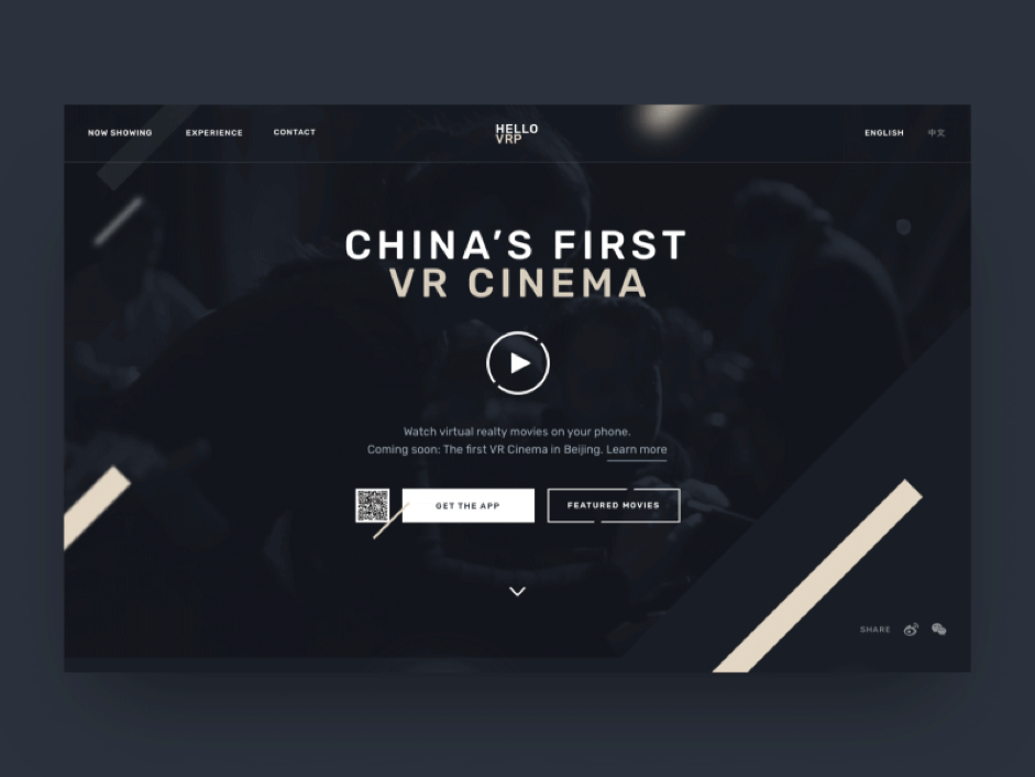
https://dribbble.com/shots/3697445-HelloVRP-Homepage
Glorify the most important features and keep them as high up the page as possible. Keep it simple and be sure to engage the user with strong images and, preferably, a video.
2. Contrast and colour
Be sure to use contrast on your page. You want your CTAs to jump off the screen and not get lost in a blur of colour. Don’t lose important information by making it illegible against the background. For a paragraph of text, you should put this information in the traditional black-on-white format. Consider using black text on a grey tint as the grey tones down the brightness of the white and makes it easier on the eye. White text on a dark background should be used sparingly, maybe to add a little difference to the way the information is dissected. Think about using white text on colour for CTAs or pull-outs to break down the information and give the user an understanding of how the details are structured.
Consider the specific colours you use for CTAs and, generally, the use of colour on the page to break the content up. You might want to break the page into the different sections. You could use colour to achieve this and this is also a good design cue so that you can break up the information into digestible portions.
Once you have developed a palette of colours that you will be using for the page, you should carefully pick out images which fit the tone that you are going for. Again, think about the contrast for the images and how best can you treat them to allow the copy to jump off the background. You want to make sure that any actionable points hold prominence on the page so the user can be drawn to them, enforcing the purpose of the page.
The use of colour shouldn’t just be reserved for purely aesthetic reasons. You need to consider that 1 in 12 men (8%) are colour blind. You should make sure that the use of colour is considerate – you don’t want to miss out on conversions by not thinking about your colour blind audience. Avoid using a contrast between red and green as this is the most common form of colour blindness. This is also where contrast has a big part to play. If you can use high contrasting colours on your page, this will make sure you are considering the colour blind audience while still ensuring everything ‘pops’ on the page.
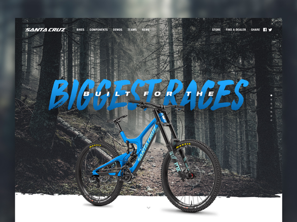
https://dribbble.com/shots/3489317-Santa-Cruz-MTB-Landing-Page
Be sure to pick a high-contrast immersive colour palette.
Being sure to make any call to actions ‘pop’.
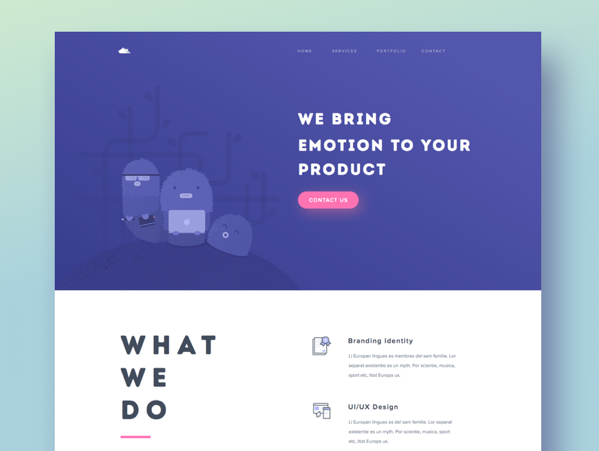
3. Directional cues (arrows, guides and imagery to direct the eye)
Using arrows and pointers on the page might seem sacrilegious from a design perspective but, in the unique isolation of a landing page, they really do work. These are obvious tactical tools that draw the attention of the eye. You should use directional cues to point towards the intended goal. This could be pointing to the CTA or even lead you further down the page. These directional cues aren’t just reserved to a big red arrow pointing to a button that says ‘click here’. For example, when we look at imagery our eyes have a tendency to follow a subject's line of sight. If you have an image of a person looking towards the CTA, that might be enough to divert the eye’s attention to that intended target.
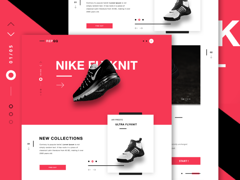
https://dribbble.com/shots/2706087-REPQQ-E-Commerce-landing-page
Direct the user to the intended target. This can be done with arrows and guidelines, but also consider using your imagery to direct the eye.
4. White space
It is important to give the user room to breathe when digesting a page. You want to allow them to find refuge in the breaks of the page. Don’t pack everything in just to save a few pixels in length. You want to be considerate to the user and ensure they remain comfortable when engaging the content. If you are organised and give the page a considered structure you can make conscious decisions about where you are going and make use of white space.
White space also makes it much easier for a user to decipher the information they are taking in, especially compared to a cluttered block of content.
You will also want to take away any exit links from the landing page. You don’t want to lose people to another area of the site and away from the intended goal. Drop the navigation and reserve any links for the intended goal only.
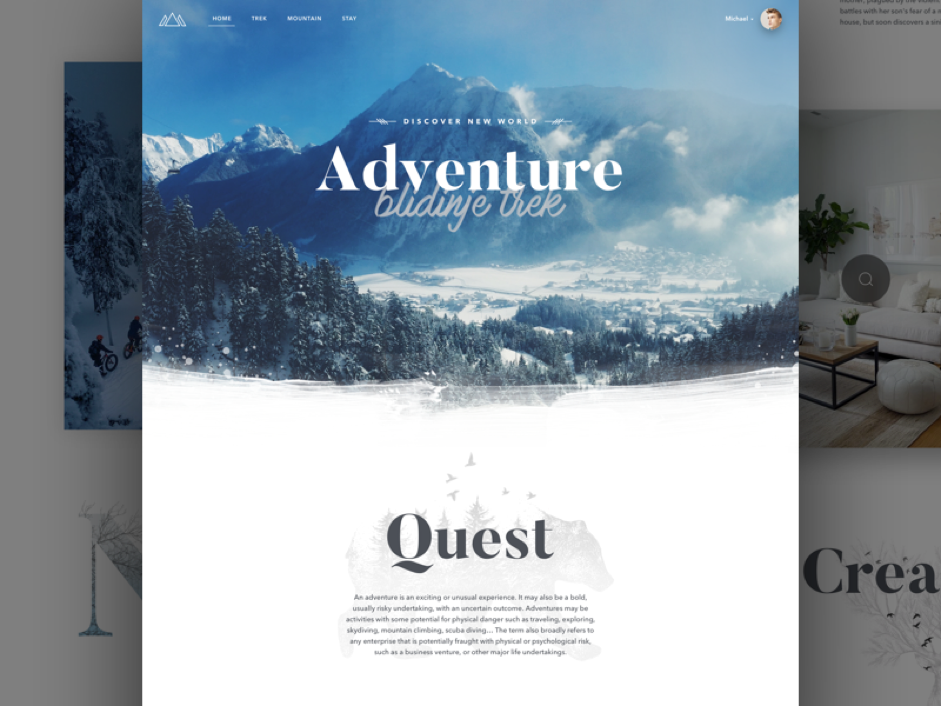
https://dribbble.com/shots/3319902-Misty-Mountain-Adventures
Give the user a bit of breathing space and don’t pack your content too tightly.
5. Urgency and pressure (if relevant)
If there is a limited time or availability, it puts pressure on the user to not miss out on the ‘limited’ opportunity. Pressure heightens the sense of urgency and helps to drive your conversion. If you are going to adopt these tactics then be clear about this in your message. You want to give the ‘deadline’ some prominence on the page. Turn up the heat early and make the most of that urgency by keeping details short and snappy.
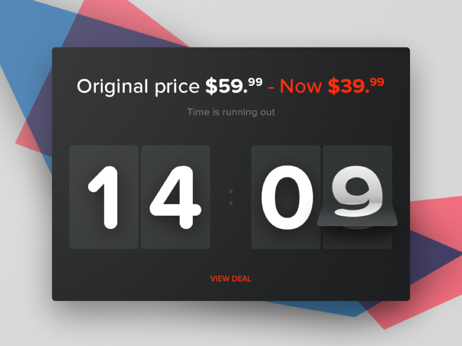
https://dribbble.com/shots/2214362-Day-059-Limited-Time-Offer
Urgency makes the user fear they may miss out. Turn up the heat and keep messaging relevant to the goal.
6. Try before you buy (free trials)
What could you offer to your customers that would make them convert at this stage? Why not allow them to test drive your product? This is a perfect way to get details from a customer and it opens the door to further marketing. You can offer a guarantee to the customer to ease any doubts that they might have and begin to build a level of trust that will further establish a strong brand-loyalty.
Think about anything else you can offer in exchange for information. Users are far more likely to convert if they are getting something extra out of the exchange. You could offer a downloadable guide or fact sheet that will entice engagement.
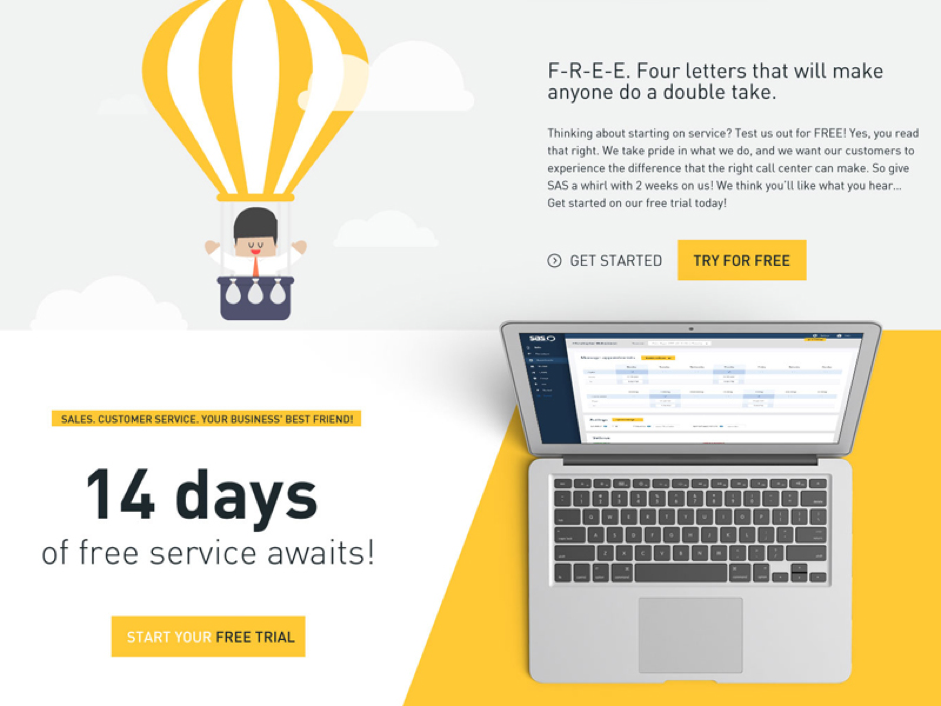
https://dribbble.com/shots/2212512-Free-Trial
An offer can convince a user that you are rewarding them with something for ‘free’.
7. Proof of your credentials
Before making sure a customer is happy to commit to making a purchase - or hand over their details - they might want to actually see that other people have already taken that plunge and are reaping the rewards. Testimonials from happy customers offer a comfort blanket and can reduce any perception of risk in a user’s mind.
You could also include reviews of a product or event as bit-sized bit of proof. If people can see a five-star review it might well ease any concerns they might have had. Using social media to quantify how many people have shared or interacted with a page this is another way that you can build a level of trust with a customer. If they can see that you’re popular, they’ll have confidence that other people have already benefitted from your product or service.
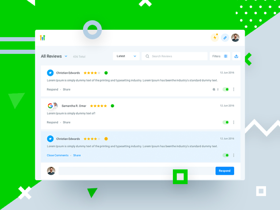
https://dribbble.com/shots/3366395-HL-Reviews
Make use of your social channels to build trust with new customers.
Structuring Your Landing Page
Now you know the core principles of CCD, it’s time to start designing your landing page. There is no one-size-fits-all approach to designing a landing page, but we have put together a couple of different options to give you a taste for how your landing page can be structured. Remember, landing pages will look different depending on the goal (is it lead-gen or click-through?)
There are two free downloadable templates for these options:
Here is a breakdown of the elements that you should make sure to include in your landing page:
- Headline
- Sub-header
- Hero element (image/video/illustration)
- A form (for lead-gen)
- CTA (you might have more than one)
- Proof of your credentials (testimonial, review, star rating, comments, etc.)
- A reinforcement statement (to maintain the viewer's interest as they scroll)
Best practice principles
As well as these CCD principles, it’s also worth noting that other web design principles should be adhered to. See our post ‘Nine Things to Consider When Designing Your Website’ for some more tips regarding web design as a whole.
Testing Your Results
How do you measure the results?
Once your landing page is live you should test it to ensure you are having the desired effect. Refer back to the key principles mentioned above and run through the following checklist of questions:
- Your headline/subhead – does it make an impact?
- Your imagery or video – is it engaging and draw in the user?
- The copy in your CTAs – how are you convincing the user to convert?
- The colour of your CTAs – are they visible?
- CTA placement – when do you see the CTA?
- Form length – is it worth their while? If it’s too long it will put people off but if it’s too short you will not get the information you need.
Here are some of the ways that these elements can be tested.
1. User testing
Why not see what your target audience makes of your page? Gather people who fit your user personas and get their feedback. This is the perfect opportunity for you take on board their views and iron out any issues they raise in terms of the experience they have of the page.
2. Heat maps
You could also invest in testing out your landing page with the use of heat maps that where the eye travels around the page or through mouse movements.
![]()
There are two patterns that your landing page could adopt, the F-shape or Z-shape. Both involve following information across the top of the page and then working down the page from right to left. The Z pattern moves in a diagonal motion while the F-shape cascades down and then back across. The entire page may not follow this format but you may want to consider putting the most important information along these lines to improve your change of conversion.
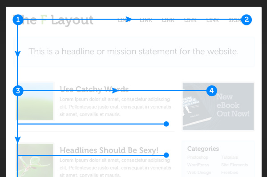
https://webdesign.tutsplus.com/articles/understanding-the-f-layout-in-web-design--webdesign-687
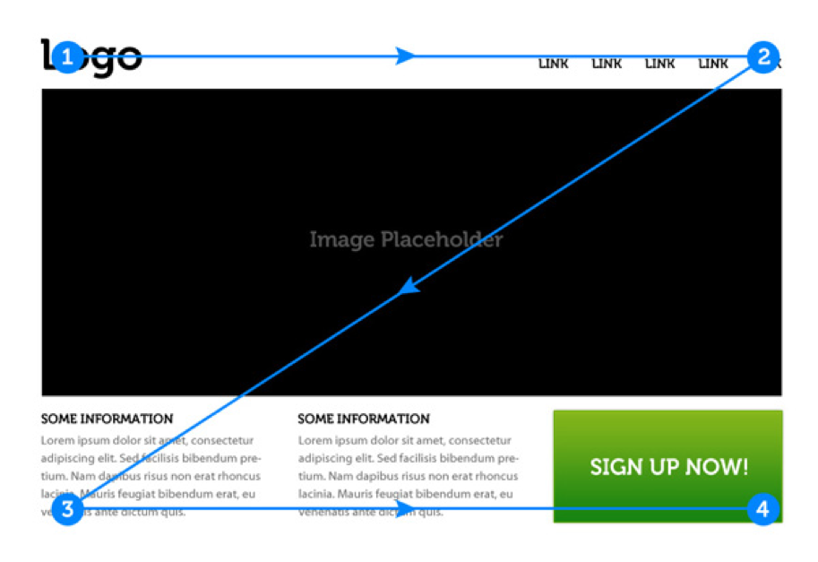
https://webdesign.tutsplus.com/articles/understanding-the-z-layout-in-web-design--webdesign-28
3. Check your analytics
Once you’ve dealt with feedback, it’s time to delve into the data. Use analytics to see how many people are landing on your page and where are they coming from. Check to see if the data matches the intentions you had when you first set up the page. You should be conscious of how long people are spending on the page and take into consideration of how long your page should take to digest. And, finally, the most important factor is the number of people who are actually ‘converting’. If your page isn’t performing how you anticipated there might be some room for improvement, which takes us nicely to our final point…
4. A/B Testing (if your budget or time frame allows)
Is your page not performing? Consider A/B testing to pinpoint some factors that could improve your conversion rate. A/B testing, in brief, is the ability to run multiple page layouts to see which one performs best (you can actually run multiple experiments simultaneously if you think that will give you the information you need). These can be monitored for several weeks and, at the end of the test, you will be able to determine the best layout going forward.
Be sure to only change a few variables when you are setting out your comparisons. If you make your pages too different there is no way of knowing exactly where one page was going wrong. Use the list of elements above to give you a good set of variables to test.
After multiple rounds of testing you can put together the results and you will be able to factor in these improvements to your landing page and boost your conversion rate.
The Wrap Up
Hopefully you should now have all the tools you need to improve your landing pages through conversion centred design.
If you still have any questions, get in touch with our highly skilled design and development team. We’ll be happy to have a conversation with you about making the most of landing pages.
Contact us here.
Sign up for our monthly newsletter and follow us on social media for the latest news.




 Proudly part of IPG Mediabrands