This year has certainly been great for new and emerging trends, in both design and development. From retro illustrations and dynamic branding to AI chatbots, the first half of 2019 has presented us with some strong trends to keep an eye on.
But what’s next for the rest of the year, leading into 2020? Here, we have gathered up a collection of the most popular design and development trends witnessed in the first half of 2019, as well as some that we think are going to be prevalent in 2020 and for years to come. Let's get started with design:
What are the latest web design trends?
Serif fonts
In a world of San Serif fonts, it can be difficult to stand out from the crowd. The likes of Proxima Nova, Montserrat and not to mention Helvetica, are in their own right beautifully designed fonts – but I’m afraid to say are overused and an easy unimaginative choice.
That’s where Serif fonts come in, over the past six months we have noticed them being used more and more in both website design and branding applications.

They create a warm and welcoming brand message, packed with personality and emotion. Worlds apart from the cookie cutter corporately styled san serif fonts. You can see the difference below:

Retro style illustrations
Retro style illustrations have gained a resurgence in popularity over the last 6-12 months, they provide a great alternative to traditional stock imagery which can often appear unnatural, fake and lacking authenticity. This is even more important if you’re trying to create a level of trust with your client or customer base.
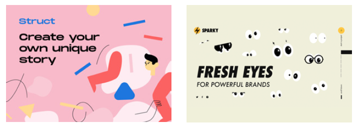
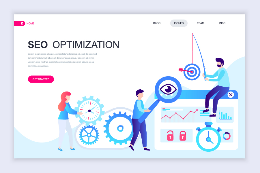
The benefits of using illustrations on your website aren’t just visual, they look amazing no matter what size the site is viewed at. Whether it be on an iPhone or desktop, vector-based illustrations will always look good and as a bonus, they are a lot smaller than their photo counterparts – taking a fraction of the time to load.
Complex gradients
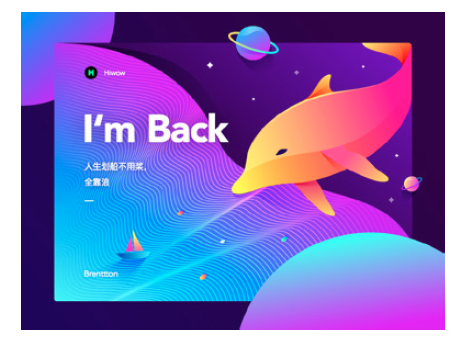
Another trend that seems to be going from strength to strength this year has been the use of complex gradients. This was initially kicked off by the likes of Instagram back in 2016 with their revolutionary logo redesign. The design blended together three to four different colours into the now iconic Instagram colour gradient, something that had not been done by such a big brand before.
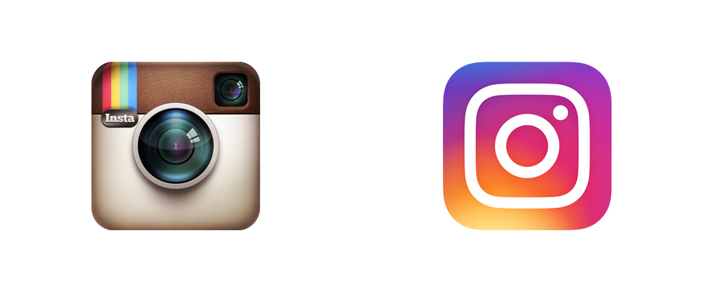
This has laid the groundwork for the use of complex gradients with other brands ever since. Having a bespoke gradient for your brand can not only make you stand out from the crowd but also gives you the opportunity to create custom branding elements using your gradient - that will be totally unique to you.
Breaking the grid
Theme based websites are available to buy for less than £50 online, they are great for creating a web presence if you have limited resources and need something cheap, easy to set up, maintain and build. However, they come with one huge drawback: your website is going to look exactly the same as everyone else who bought the exact same theme as you!
Breaking the grid in web design is a new and emerging trend where designers and developers push the boundaries of what we think a website should look and work like.
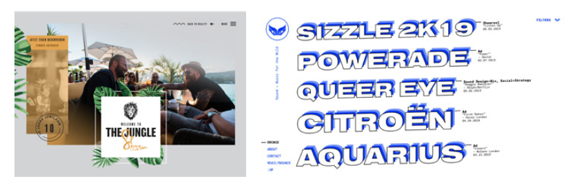
This is hard to capture in an image, but some great examples of this are Reflektor Digital, and FAT FAT FAT Festival. Check out those sites to see how breaking the grid creates a really unique experience, allowing you to display brand personality to your audience. This kind of website works really well for brands who want to break the mould and stand out. There are no rules to follow and the sky is the limit, go crazy!
Dynamic branding
Dynamic branding is where your important branding elements, such as your logo, are able to adapt and change. There are thousands of different media in which your brand is going to be consumed, from a giant billboard to a smartphone. Therefore, an adaptive brand gives you the flexibility to have a suitable logo and branding assets for all potential outcomes.
Perhaps the logo changes to better match the context it is placed in, or maybe it is affected by the current time or temperature. Dynamic branding is at its strongest when the brand is already established, stripping away branding or logo elements but still being recognisable is a great achievement and can create some stunning design work.

Isometric design
Whilst isometric design isn’t necessarily a new design trend for 2019, it is one that has been gaining popularity over the last year. It creates immersive spaces that clients and customers can get lost in, admiring the detail and depth created in the illustrations on your website or creative.
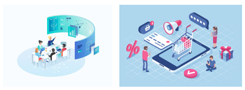
They can bring the boring to life - isometric design works especially well with brands and companies that may struggle to visualise what they do through ‘typical’ means (such as stock photography). Isometric design also benefits from the previous points we touched on when we spoke about retro illustrations, such as site speed and viewability.

Site development trends
One-page websites
One-page websites are becoming more and more popular with brands who want to create effortless navigation, intuitive designs and easy to digest content. There is a clear beginning, middle and end to the site. This means there is no more getting lost down a rabbit hole of 15 clicks - everything you need is on one single page.
One-page websites also translate well across different devices, this helps keep development costs down as well as reducing the amount of testing required. Load times also benefit from one-page websites, they load a lot quicker than a conventional multi-paged website.
Chatbot AI
Over the last year, we have seen the number of chatbots featured on websites increase dramatically. Users want to be able to speak to someone directly on the site without having to use another contact method, such as over the phone or email. In 2019, we have seen the technology behind chatbots develop at an incredible rate, we are now seeing chatbots that are able to respond to detailed requests and learn from what they are being asked. This is a big step up from years gone by where only basic questions could be answered about products, ordering and shipping etc. Expect to see lifelike chat personas that you can speak to like a real human in the very near future.
Adaptability website design
With the majority of web traffic being mobile based, it is industry standard to design ‘mobile first,’ with this in mind we have noticed a trend of developers abandoning responsive website design. This is where all your content is scaled and forced into a mobile screen. This sacrifices the usability of the site at mobile size and lowers click-through rates and can also reduce traffic to your site.
The idea of creating a website that is adaptive rather than responsive is something new, rather than forcing the content into the mobile screen there are set layout styles that do not change layout positioning when scaled. This means that every user receives a good experience of the website whatever device it is being viewed on, creating a more enjoyable experience for everyone.
More animations and illustrations
With faster internet speeds and advancements in technology, developers now have the capability and freedom to really push themselves. We have seen a big trend in more illustrative web designs with more animations and interactive elements.
Creating beautiful animations on websites such as parallax effects and fade ins can do wonders for a site build and design, lifting what could be considered a standard and boring layout to one that has elegance and creates an emotive response from the user. As we mentioned earlier the benefits of using illustrations are not just skin deep, they keep site size down and the load speed fast.
Multimedia long reads
Multimedia long reads are a fantastic developing trend we have observed over the past year, a great way to tell an emotive story through an engaging and fully engrossing long read web page. Developers are able to flex their creative muscles in multimedia long reads with beautiful animations, immersive content and lots of space to play with.
This type of site is truly memorable for the user, it creates an experience, something that sticks with the user and makes a connection with the brand or business. While not suitable for a typical website, multimedia long reads are great for storytelling or landing pages.
Alternative websites
To anyone outside of the design and development world, landing on one of these websites you might think ‘what the hell am I looking at?’. Well, this is a new trend in website design and development where all the rules go out the window.
Anything goes – from giant floating text to inverted images that spin around when you hover on them. If you want to make your website to stand out from the crowd and really get people talking, designing and building an alternative website is certainly the way to go. Functionality is often sacrificed for form, making something look good takes priority here. It certainly divides opinions when brought up for discussion, the question is are you brave enough to go alternative?
Conclusion
This year has proven already to be a hot year for new and emerging design and development trends, technology and the tools used to build and design websites is progressing at a near-exponential rate. We expect to see these trends develop even further in the second half of the year and some new emerging ones to arise as we head into 2020 - keep an eye on our blog to see our thoughts and ideas in the coming months! And in the meantime check out the design and development services offered at Zazzle Media!
Sign up for our monthly newsletter and follow us on social media for the latest news.

 Proudly part of IPG Mediabrands