

Over the past few years the online landscape has rapidly moved forward and, as times have changed, so has digital content and the devices we use to access it.
It’s now more important than ever to have a well performing and mobile-friendly website that serves great content to both desktop and mobile users. Those using mobile shouldn’t have to settle for a poor experience purely based on their device. In this post we’ll cover the importance of a mobile-friendly website and the common approaches used to create one.
All being well, you followed the steady rise of mobile and have already built and tested your mobile-friendly website using the Mobile-Friendly Test and PageSpeed Insight tools provided by Google.
If you missed the boat and you’re starting to panic, then fear not, here’s a useful walk through to help guide you in the right direction. The first step in creating a mobile-friendly site is to decide which approach is most suitable for your website: a dedicated mobile site, responsive design or dynamic serving.
Why Create a Mobile-Friendly Site?
The bottom line is that you should always want an SEO-friendly website and one that provides the best possible user experience. Before we get into the technical side of things, let’s just take a minute to understand the importance of a mobile-friendly site.
The steady growth of mobile in the last few years has made big waves in the digital ocean. From the way content is created to the way it’s distributed – it’s had an incredible impact within the industry.
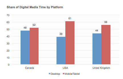 The table above, using data taken from a March 2015 comScore report reiterates the growth of mobile and how mobile usage has now surpassed desktop in all three of these demographics.
As Google has closely monitored this growth, it has pressed forward with its ambition to improve the online experience for these users. Google has also started to reward mobile-friendly sites with improved search rankings for those searching with mobile devices.
Aside from regular updates to the search algorithm, let’s have a quick recap of how Google has updated their algorithm to enhance the search experience specifically for mobile users.
June 11th 2013
Google published an article discussing the changes in rankings of search results for smartphone users. This post predominantly outlined faulty redirects and how to fix them, along with a few tips to help your site become a better experience for mobile users.
November 18th 2014
After months of testing, Google announced the introduction of a ‘mobile-friendly’ label to help mobile searchers quickly find the information that they’ve been searching for.
February 26th 2015
Google published a rare post warning the online community of an impending algorithm update that would expand mobile-friendliness as a ranking factor and have a direct impact on search results.
April 21st 2015
Google rolled out the promised algorithm update that was quickly dubbed ‘Mobilegeddon’. The update was so significant that it caused non-mobile-friendly sites to drop from top search results entirely. The update only affected mobile search results.
How can I create a mobile-friendly website?
If you’ve made it this far then hopefully you’re still interested in creating a mobile-friendly experience for you users. Good! Fortunately, there are several options to consider when it becomes time to make the jump.
Responsive Web Design
Responsive design exploded in 2013 as a cost-effective and mobile-friendly solution for site owners. Serving the same on-page content across all devices, using the same URL, also allows for easier site maintenance. Due to its relative simplicity and popularity, Google is an avid supporter of responsive design. The 'big G' even offers some solid documentation for those looking to learn the fundamentals.
For information about responsive design, you can also read our comprehensive post here.
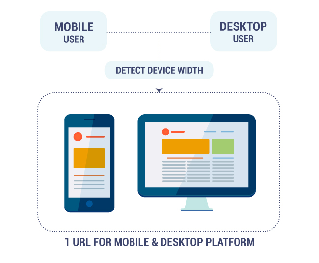
How does it work?
When a user visits a responsive website, the page is automatically adjusted to match the width of the device. Content is then stacked in a particular fashion to help the user easily navigate the website by scrolling vertically. Rather than creating separate platforms for desktop and mobile, only one URL is required for each page.
 Modern CMS platforms such as WordPress, along with CSS frameworks like Bootstrap and Skeleton, are developed using responsive design principles. These resources are now making it much easier for site owners and SMEs to create a mobile optimised website with a relatively small budget.
Examples of Responsive Design
http://www.currys.co.uk
http://www.nixon.com
http://www.walmart.com
http://www.notonthehighstreet.com
Pros
One URL for all pages and all devices.
Cost effective (can be created with small budgets).
Easy maintenance.
Endorsed by Google.
Cons
Content-heavy sites may have significant loading times for mobile devices.
Content is adapted to suit rather than a mobile-first approach.
Dedicated Mobile Site
This approach is used to serve a specific site to mobile users only. If the user agent of a specific device is detected, the user is directed to the mobile site using a different URL than the standard desktop site. Dedicated mobile sites are most typically seen as a subdomain (m.onlineshop.com) or less commonly implemented as a subfolder (onlineshop.com/mobile).
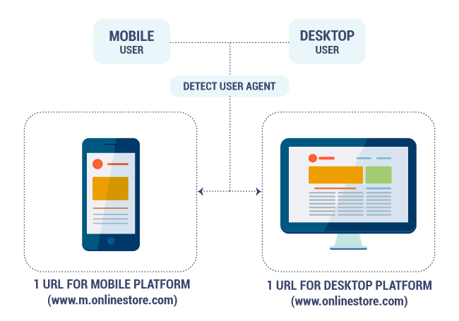
How does it work?
When a user visits a website with a dedicated mobile site, server-side JavaScript is used to detect the user agent of the device. If the site identifies a mobile device, the user is then redirected to the appropriate platform on a separate URL.
 Unlike a responsive website, a dedicated mobile site allows the site owner to customise the experience for the user rather than display the same content as the desktop site. Although this can result in a much better experience for mobile users, the added maintenance of managing two platforms on two URLs can deter some site owners.
Examples of Dedicated Mobile Sites
http://www.johnlewis.com
http://www.adidas.co.uk
http://www.ikea.com
Pros
Allows the site to serve mobile-specific content.
Cons
Potential SEO issues if incorrectly configured.
Multiple URLs for single pages (desktop and mobile).
Higher maintenance costs to service multiple websites.
Dynamic Serving (RESS)
Dynamic serving or RESS (Responsive Web Design + Server Side Components) combines elements from both of the previous approaches. Although this is the most advanced approach to creating a mobile-friendly site, it allows you to serve content based on a specific user agent using only one URL.
Although this approach is more complex than either of the previous options, it allows much greater control, user targeting and scalability; particularly when used for large ecommerce sites.
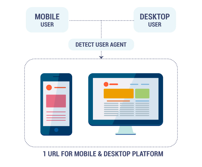
How does it work?
When a mobile user visits a dynamic serving website, server-side JavaScript is again used to detect the user agent. HTML, CSS, and JavaScript written for the mobile platform is then served to users rather than the standard webpage that appears for desktop users.
 By serving content specific to the platform, this allows a much greater experience for mobile users than a responsive site. This is an important factor to consider when looking to improve click-through rates or reducing bounce rates.
Examples
http://www.amazon.co.uk
https://www.etsy.com
https://www.booking.com
Pros
Allows the site to serve mobile-specific content.
One URL for all pages and all devices.
Improved performance for mobile users.
Cons
Requires a technical implementation.
Can be very costly to develop.
More difficult to maintain than RWD.
How can I check what approach a site is using?
If you’re curious as to which mobile-friendly approach a website is using, there’s a few quick and easy ways to check.
Check for Responsive Design
If the website is responsive, simply reduce the size of the browser window and the content blocks will begin to reduce and eventually stack vertically.
Check for a Dedicated Mobile Site or Dynamic Serving
You can follow the following steps to test either of these options but will have a different result depending on the approach being used.
- Using the Google Chrome browser, navigate to the site you want to investigate.
- Open the Inspect Element tool (Right Click > Inspect Element).
- At the bottom of the Inspect Element tool, you should see a row of tabs.
- Select the ‘Emulation’ tab and choose which device you wish to emulate.
- Once you’ve selected a device you’ll need to refresh the page.
- After the page has reloaded, take a look at the URL. It’s always worth navigating through the site or clicking on products to monitor any URL changes.
Does the site redirect to a new URL?
If the URL has now redirected to a new domain (eg. www.m.examplesite.com), it will be using a dedicated mobile site.
Does the site keep the same URL?
If the URL remains the same but the content differs from the desktop version of the same site, it will be dynamic serving different content to mobile users.
Summary
Ultimately, there are several options to consider when creating a mobile-friendly website. Although a responsive website is a relatively safe approach for the majority of the websites, it’s worth investigating each approach in accordance with your requirements and budget. The bottom line is that unless you create a mobile-friendly site, your site runs the risk of reduced search visibility and a poor experience for your mobile users. A key takeaway to remember is that mobile is here to stay and if you haven’t made the jump to a mobile-friendly website, now is the time!
Stay in touch with the Zazzle Media family
Sign up for our monthly newsletter and follow us on social media for the latest news.


 Proudly part of IPG Mediabrands