

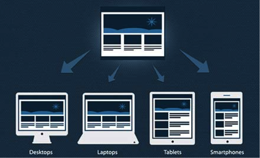
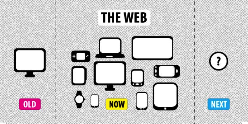
Responsive design has been one of the cornerstones of 2014 digital strategies. Getting 'it' right across all devices is now critical to success with as much as 60% of traffic now coming from mobile. The question is how to do you ensure you create the right 'experience' for your customers and visitors? With an ever-evolving rule book it's important you truly understand the basics and, critically, how to test? Let's dive into that in a little more detail now.
What is Responsive Web Design?
Let’s not beat around the bush here. The easiest way to explain and to understand responsive web design – or RWD – is for you to actually see it in action. You may have noticed that this blog is an example of responsive design in its own right. To see this in action simply open this post in a new browser window and scale down the width of the window. You’ll notice the content will dynamically adapt to the width of the window and restructure the content to flow appropriately and suit the screen size.
But is RWD really worth doing? With such a range of digital devices of varying screen sizes, responsive design gives the user the best possible experience without sacrificing content or usability. Responsive design is existent for an easy-reading experience no matter what device you are using or where you are.
Brief History of Responsive Web Design
Before the development of ever-so-reliable responsive digital design, layout was the first thing many of us thought about when it came to designing a webpage. And those involved in design often came from a print background rather than digital.
In print, canvas size was always set to certain parameters, whether for designing a book cover or a magazine spread. Each designer had set dimensions to work to when designing the layout; there was no flexibility. When mobile phone screens became larger – along with the odd tablet of the time – conventions changed. The canvas size of the web would allow for all sort of screen sizes and resolutions, meaning your website could be accessed from almost anywhere, but not all devices worked to the same canvas size, which caused an issue. Designers went on the lookout for a solution to fix this problem, which is when responsive web design stepped in.
In 2000, John Allsopp wrote about the change from the constraints of print to the freedom of web design:
“The control that designers know in the print medium, and often desire in the web medium, is simply a function of the limitation of the printed page. We should embrace the fact that the web doesn’t have the same constraints, and design for this flexibility. But first, we must ‘accept the ebb and flow of things.’”
In early 2010, a chap by the name of Ethan Marcotte wrote an article on A List Apart and, in doing so, he pretty much nailed the term ‘responsive web design’ on the head. The article expressed the need for a design to have a fluid grid, flexible images and media queries.
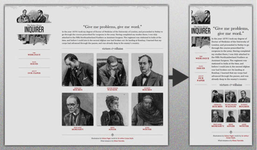
Image from the article that first pinpointed the term ‘responsive web design’.
Designers: Plan Ahead
When creating an effective and efficient webpage design take the necessary time to plan every single element involved. Web development has advanced significantly over the last few years and is much more complex than simply using a one-size-fits-all approach. With so many different device sizes available, it becomes an impossible task to design for every size. A responsive design allows you to future-proof your website and for it to perform as well as possible on all devices, from mobile to tablet to desktop.
Although it was a much-debated topic in the early days of responsive design, popular opinion among the modern web development community is to code with a mobile-first philosophy. Focusing on the mobile version first allows you to start with the essential requirements and scale up by adding features to provide the user with an even greater experience.
While it’s still common for many developers to code for tablet/desktop first, it is sometimes challenging to know what features or content needs to be restructured for mobile. A mobile-first approach allows you to identify the most important and crucial elements of a site and provide the greatest experience possible.
Important interactive features, such as a call to action, rollover or animation, should also be considered when developing for mobile. As this experience is quite limited on mobile devices, it can be added when scaling up for laptop or desktop screen sizes. The mobile-first approach allows you to create a solid foundation that you can build on as you scale.
As mobile browsers are still relatively young when compared to their much older desktop brothers, many features are not cross-browser compatible between devices. It should also be noted that many programming languages do not perform to the same standard on mobile as they do on desktop.
The Mock-up: a Fundamental Requirement
Design mock-ups serve a great purpose when developing a website. They will help to justify where your breakpoints will appear and prove helpful when organising content within the page, as well as how it will appear within your design grid. This ensures the page has good structure and that it can be scaled.
A mock-up is also an invaluable tool to help demonstrate how a design will look to a client. It allows you to demonstrate the functionality of the website but also provides a working ‘look and feel’ to help settle any nerves. As a mock-up is usually done at a fairly early stage within the project, it affords a great opportunity to gather feedback and make any amends to help save time further along the development cycle.
Working prototypes are making big ground and are sure to take off in 2015 to help showcase not only how a design looks, but also to demonstrate the site’s functionality on different devices. Online tools such as Macaw, Webflow, Axure, Invision and HotGloo are worth checking out and are relatively affordable. The beauty is that many of these tools enable you to build a prototype without writing a single line of code.
Keep it Clean. Keep it Simple
With the continued growth of responsive design, we are seeing the steady development of a more minimal approach to digital design with a greater focus on content – and rightly so! Designs incorporating the ‘white space’ approach have seen a massive boost in recent years, which has only helped to increase the adoption rate of RWD. With clean lines, defined content blocks, sharp calls to action and crisp images, web developers have a much clearer understanding of how to arrange content when using different devices.
Resources
Google PageSpeed Insights
This tool is used to give guidance on best practices to follow during your site build in order to attain higher visitor engagement, retention and conversions. Although the name may be misleading, the tool gives you advice on best practice when it comes to user experience on a mobile. The tool tallies up elements on your website to give you an overall mark out of 100. To achieve the full 100 the tool offers up some fixes that you should apply to your website.
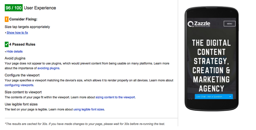 You can find the Google PageSpeed Insightstool here.
Google Chrome (Emulator Tool)
The Developer Tools found within Google Chrome are incredible and useful to web developers of all skill levels. Google has also included a responsive feature, which scales to any width and height.
You can find this development tool by doing the following:
- Right click the Google browser page, which takes you to Inspect Element.
- Click the mobile symbol next to Elements, which will take you to the responsive screen.
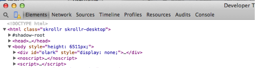 You can scale the website to fit a variety of screen sizes and devices.
This Is Responsive
This is a brilliant website to help keep your knowledge up to date and keep you in the loop with the latest responsive design news. Bookmark this site in your browser to make sure you don’t miss the latest developments.
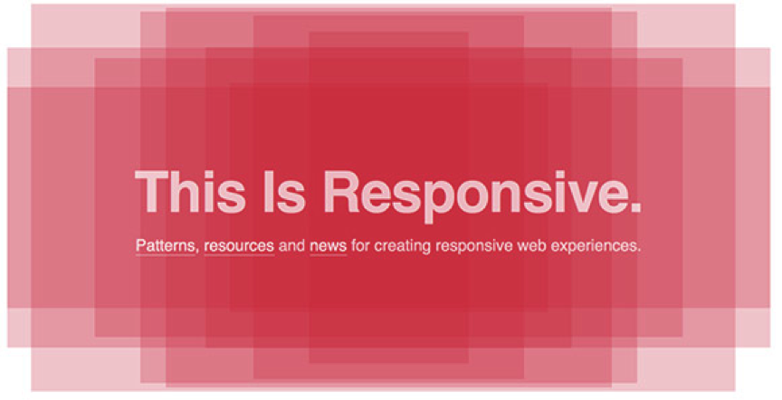 This Is Responsive– Bookmark it now!
Bootstrap
Bootstrap is an extremely popular framework originally developed as an internal project for Twitter. It can be a useful addition to any website build as it is packed with useful features. Featuring a 12-column, fully responsive grid, this is a great foundation when developing a new site or updating an existing one. Although it may seem ‘bloated’ to experienced developers, it has appeal across a broad skills range.
 Link to Bootstrap
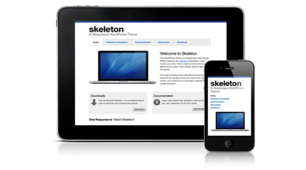 Skeleton

The name Skeleton pretty much sums up this handy resource. It is basically a stripped down version of Bootstrap without any design styling added, but is very much ready to adapt to whatever styling you are going to throw at it.
Developers often use this boilerplate as it incorporates the core principles for responsive design, which will help speed up any web development project.
Responsive Design: Tips For Beginners
Add A Viewport
When it comes to dipping your toe into the responsive pool, remember that your web page always requires a viewport meta tag. This meta tag is a critical component when coding for a multi-device world.
But what is a viewport, you ask? Simply put, a viewport instructs a device’s browser that the page needs scaling so it can fit on the screen. You put this meta tag in the head of your web pages. We would recommend just using the default viewport meta tag for starters:
<meta name="viewport" content="width=device-width, initial-scale=1.0">
Setting Your First Breakpoint
A break point allows for elements on the website to be better positioned to best suit the screen size. We can do this via Media Queries.
To find the width of the screen right-click on the browser screen and click Inspect Element, which will open a window showing your source code and CSS in the right-hand column. You can use this to work out the current browser screen size. The width is shown in the top right-hand corner as you scale the width of the browser down. This is handy because you can effectively see where the breakpoints need to start, instead of guessing.

An ideal way of setting up your media queries would be to have a separate style sheet called ‘responsive’ for example. You should structure your media queries from the biggest width to the smallest, making it easier for you to find and read your code.
How can we find these breakpoints? Open the page with the Inspect Element tool found in Google Chrome and scale down your website width. You should be able to see when the website starts to ‘break’ and the page structure looks out of place.
For example, your page may look out of place once it’s been scaled down to a width of 700 pixels. Using this as a guide, you now know the breakpoint and can use the following media query to modify the page structure:
@media (min-width: 600px) {}
Push Yourself
Although this post has covered several areas of responsive web design, make the most of the online resources available to help develop your skills. There is a huge amount of learning material at your fingertips – you just have to find it.
Don’t be afraid to experiment with new code and try something new. JSFiddle and CSSDeck are two free online sandboxes that allow you to quickly experiment with new code snippets.
The web is evolving every day and it is important to keep on top of new web technologies and methodologies to be able to deliver good-quality content. Who knows where web design will be in a few years, but by having responsive web design in place you stand a good chance of tackling it as and when the changes happen.
Stay in touch with the Zazzle Media family
Sign up for our monthly newsletter and follow us on social media for the latest news.


 Proudly part of IPG Mediabrands